IAM Login Flow Usability Test Report
by Sami Souders, Designer
Stakeholders: Nicolas * (Hub PM), Nick * (IAM Consultant)
Contents
- Project Intent
- Usability Testing Summary
- Recommendations for First Release
- Recommendations for Future Release(s)
- Appendix
- UX Research Plan
- Recruitment Email
- Testing Script
- Feedback summary
- Live Testing Form
- Responses
1. Project Intent
The purpose of conducting this usability study was to gather user feedback on two different login flows. Our primary goal was to see if user testing justified our recommended alternate solution to the existing login process ISRM proposed. Our secondary goal was to identify any weaknesses in the user experience, both in the technical writing as well as the content within the login process itself.
2. Usability Testing Summary
We developed two different login flow sequences and identified three possible user personas. I compiled these screens into a paper prototype that followed a single or set of emails attached to each persona. I reached out to 26 McKesson employees and contractors at the King of Prussia office, six of whom were able to participate in the study. After explaining the purpose of the study and giving test participants some general instructions, I individually met with them find out how they would complete various tasks using the prototype. I recorded users answers and compiled their feedback to determine which of the two login flow scenarios most users prefer. I concluded that while users disliked completing a CAPTCHA, they preferred it to completing several sign in screens to access their application each time. This information was relayed to the ISRM team and we were able to eliminate both the additional sign in screens and the CAPTCHA to the sign in pages while still achieving the required level of security.
3. Recommendations for First Release
- Sign In screens need to indicate which part of the sign in process users are on.
- i.e. Sign In (Step 1 of 2)
- Language needs to be added to emails to address and clarify a variety of user concerns.
- Stand-alone Application URL doesn’t prepare users for a login screen. Indicate that they will be taken to a login screen for their application after clicking the link.
- Provide an expiration date for the temporary password.
- Make it clear that users can access their application a set number of times before changing their password with the MHS User Access Portal, if that is the case.
- Let users know that they will need to refer to the application URL provided in the email and not the MHS User Access Portal to access their application.
4. Recommendations for Future Release(s)
- Give users the ability to access their applications directly from the MHS User Access Portal.
5. Appendix
5.1. UX Research Plan
Background
The Hub must provide MHS application developers with an option to use the Hub to manage its users (Sign in with McKesson). This feature will result in users of that application seeing McKesson-branded login, profile, and username/password help pages. Sign in with McKesson will utilize the Hub for its user store. Single-Sign On (SSO) is required between all Hub applications that use Sign in with McKesson.
Goals
Conduct A/B testing to determine if there is a login sequence users find more intuitive in an effort to prevent excess user error during sign on.
Research Questions
- How do people expect to sign into the Hub applications?
- Do users expectations meet the reality?
- Does the process support users’ ability to accomplish key tasks?
- Do users understand the instructions?
- What are the most common errors users make when trying to log in?
Methodology
A usability study will be held in the KOP office with 10 participants. Each participant session will last 10 minutes and will include a short briefing, an interview, a task performance with a paper prototype and a debriefing. Among the tasks: login as an individual user, login as a user from a company, request help logging in, and more.
Participants
- McKesson employee in KOP
- Age 22-60
- Has various levels of knowledge of the Hub
Schedule
Recruiting: begins on November 4
Study day: November 5 & 6
Results Delivery: November 7
Script
5.2. Recruitment Email
Greetings,
The Intelligence Hub team is looking for people willing to participant in a small usability study in an effort to improve the website’s login process. Apologies for the late notice, but we are looking to get some feedback before Friday.
What do you need me to do?
You will be asked to describe steps you would take to complete tasks on a website based off a paper prototype. You will also be asked questions about your knowledge of the Intelligence Hub and your role at McKesson.
How long is a session?
<15 minutes
When and where?
The study will be held Wednesday afternoon and Thursday morning of this week. The test can come to you or you can visit the cubes near the North Carolina huddle room. Again, apologies for the late notice. If you’re not available but know someone at McKesson in KOP who might be, please pass this email on to them. The only requirement for eligibility is to not be a member of the Hub team.
Interested in participating?
Please reply to this email with your availability for this week. (You don’t need to reply all.)
If you have any questions, please contact me at sami.souders@mckesson.com.
Thank you for helping the Hub out!
Sami Souders
///////////////////////////////////////////////////////////////
/// Sami Souders | McKesson Health Solutions
/// Analyst | Intelligence Hub
///////////////////////////////////////////////////////////////
5.3. Testing Script
SCENARIO 1
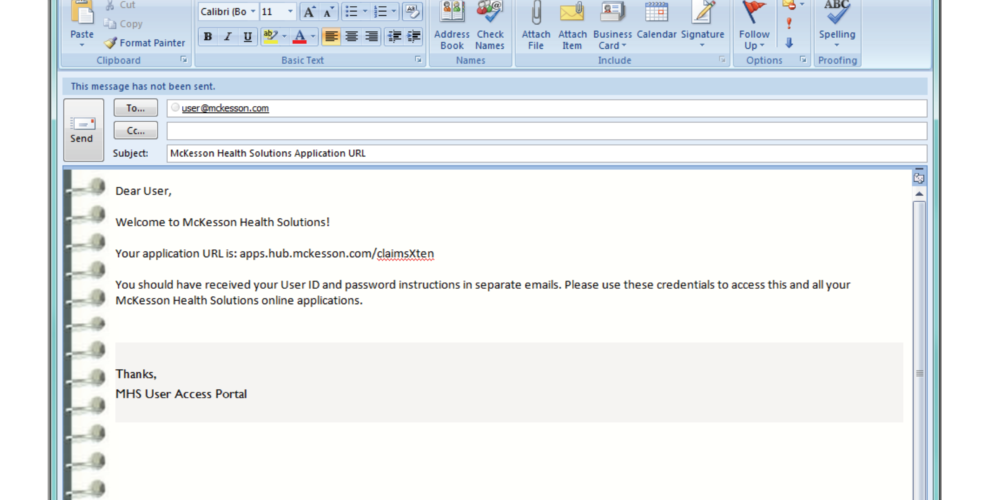
You’re a McKesson employee who needs to access CXT for the first time.
You’ve just received this email.
Does this email make sense to you?
What is your next step?
Where do you expect the URL to take you?
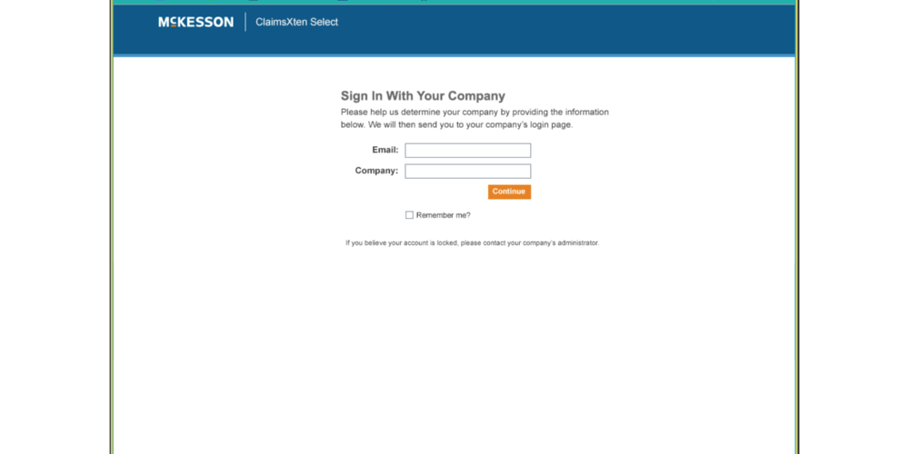
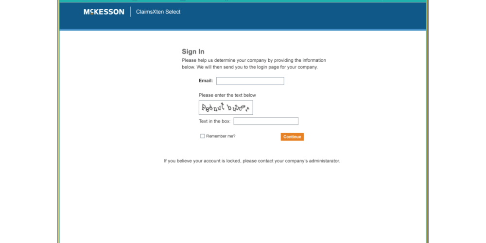
This page appears after you click the URL.
What email do you use to sign in?
Can you read the captcha?
How do you feel about captchas in general?
After you enter in the information, What do you expect the next screen to be?
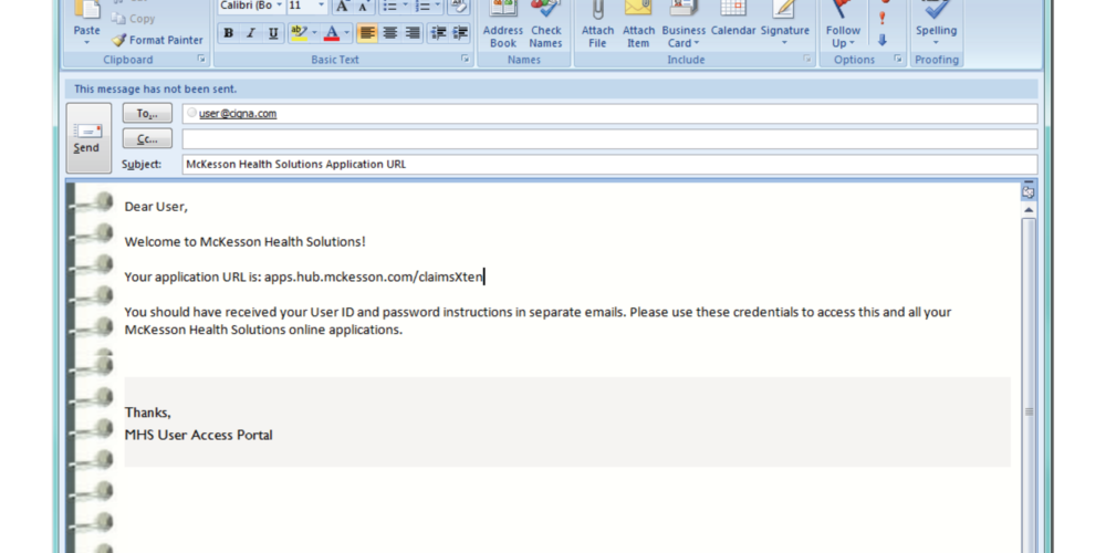
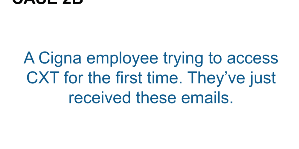
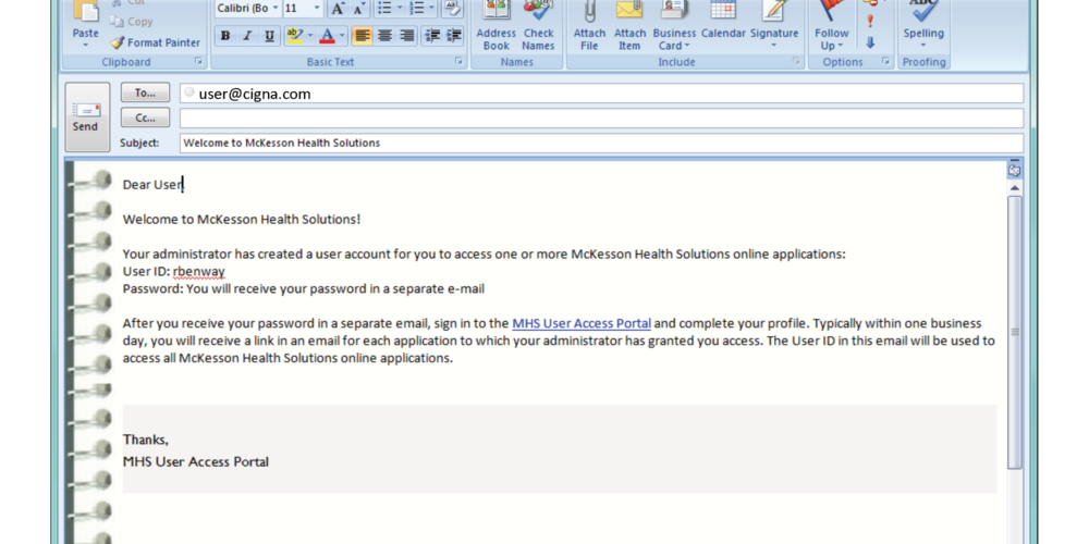
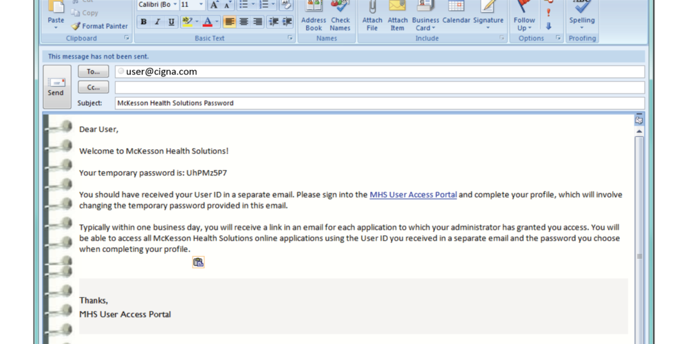
You’re a Cigna employee who needs to access CXT for the first time.
You’ve just received these emails.
Do these emails make sense?
What do you do next?
Where do you expect the URL to take you?
This page appears when you go to the application’s URL.
What email do you use to sign in?
After you enter in your information, what do you expect the next screen to be?
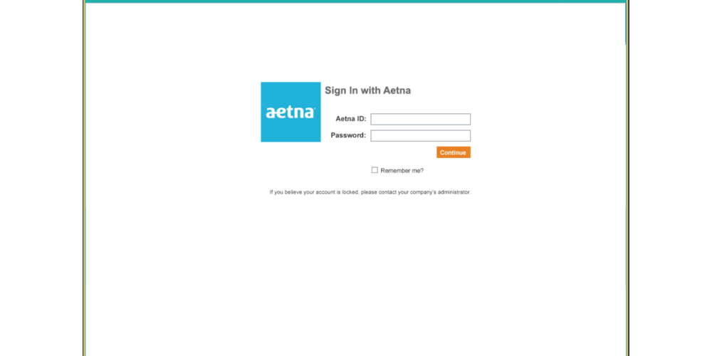
You’re a Aetna employee who needs to access CXT for the first time.
Your administrator has told you to login with your Aetna username and password.
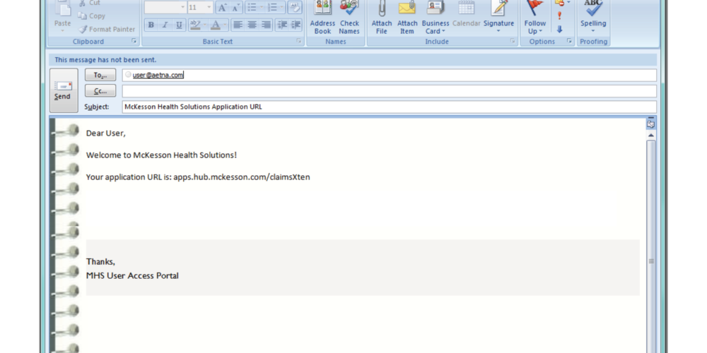
You’ve also just received this email.
Does this email make sense to you?
What is your next step?
Where do you expect the URL to take you?
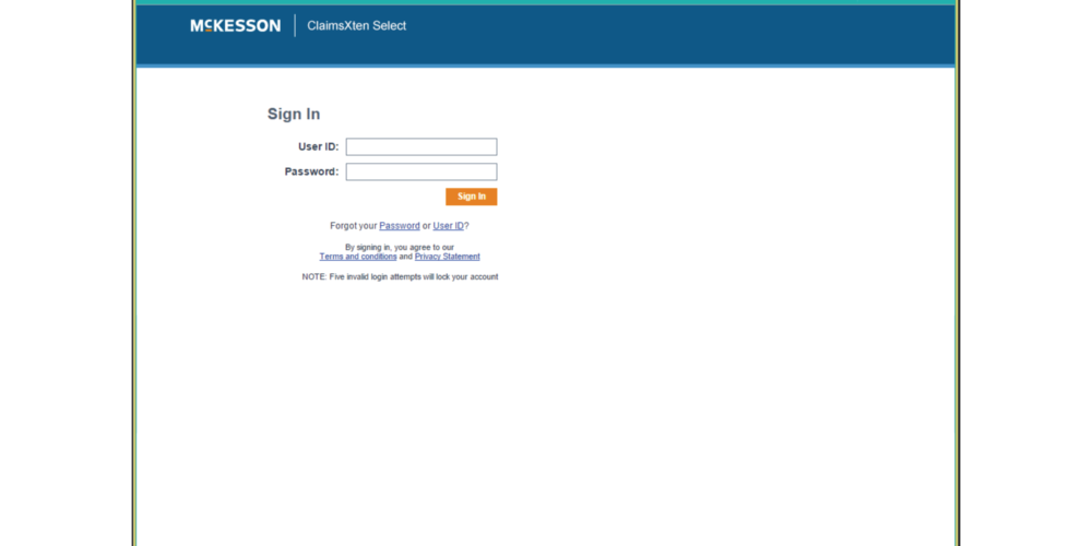
This page appears after you click the URL.
What email do you use to sign in?
What do you expect the next screen to be?
SCENARIO 2
You’re a McKesson employee who needs to access CXT for the first time.
You’ve just received this email.
What is your next step?
Where do you sign in?
What do you expect the next screen to be?
You’re a Cigna employee who needs to access CXT for the first time.
You’ve just received these emails.
What do you do next?
Where do you sign in?
You’re a Aetna employee who needs to access CXT for the first time.
Your administrator has told you to login with your Aetna username and password.
You’ve just received this email.
What do you do next?
Where do you sign in?
What do you expect the next screen to be?
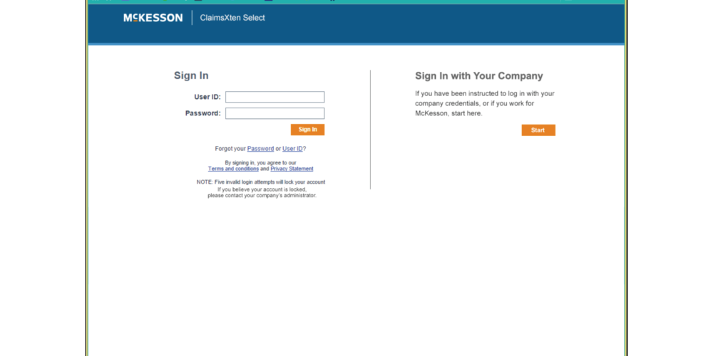
You see this screen, does it make sense?
What would the next screen be?
Was there a sequence you preferred?
5.3. Feedback Summary
- Users generally disliked captchas BUT
-
- Users understood their purpose and the need for them to prevent bots
- Emails were understood, but not easily
- Subject lines were unclear/misrepresentative of content.
- Users thought “welcome” email should be application link and not user ID
- Users thought the email containing the user ID should have “user ID” in the subject line
- Subject lines were unclear/misrepresentative of content.
-
- Users wanted to know where exactly the email was coming from and could they reply to it? Would the “from” match the signature line?
- Users wanted less emails but more detailed ones to provide context as to why they received it and how to proceed
- Users wanted to know why their username and password were sent separately and how long the temporary password would last
- Users generally thought they could access their application thru the MHS User Access Portal
- Users didn’t understand if they had to change their password before they could access the application
- Users wanted to know how their administrator would have told them to login using their company’s username and password
-
- Users were not expecting to arrive at a login screen after clicking the application URL from the email
- Most users expected the link to the application to take them to the application.
- If the link to the application had said login to the application with this link, users would have been less surprised upon arriving at a login screen
- Log in screen confuses users who don’t know if they have an account or not, especially by not asking for password. They want to know if they’re logging in or signing up.
- “Sign In” page title confuses users because they aren’t signed in by just entering their email and filling out a captcha.
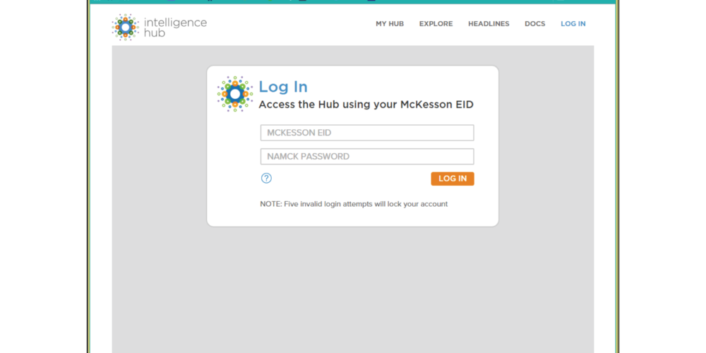
- “Log In” hub page confuses users because they were just at a sign in page that looked totally different and now there is new language telling them to do what they thought they just did.
- Users thought by entering their email, they would get a confirmation to that email indicating their account creation, indicating that users do not know if entering their email on the first “Sign In” page is creating their account, requesting access to their account, or the start of a recurring login process.
- Users were not expecting to arrive at a login screen after clicking the application URL from the email
-
- Users were generally confused by the dual “Sign In” screen
- Some users wanted to login with their EID from this page
- Users considered clicking on the forgot user ID and password links because they didn’t know where to go
- Users who had received user IDs and passwords still wanted to sign in with their company
- Users without user IDs wanted to sign in with their company credentials on this page
- Users were annoyed by being asked their company after they provided their email
- Users were extra annoyed when told they would have to enter in their company each time
- Users were generally confused by the dual “Sign In” screen
- Conclusion: While users disliked completing a CAPTCHA, they preferred it to completing several sign in screens to access their application each time.
5.5. Live Testing Form
5.6. Responses

